Improve UX and rebrand alignment
Two or maybe three birds with one stone
We needed a rebrand. That was obvious. We'd spoken for quite some time about the fact the phrase "Scraping Hub" might have some negative connotations haha.
So, we embarked on a journey of discovery. This involved numerous interviews with existing customers. We even looked into the colour spectrums that we could own as a brand. Then we came up with 100's of names and settled on a few before embarking on trying to secure a domain and trademark.
Ok, so this story isn't about the brand though. This story is about how we improved our conversion rate on our website. Implementing a fresh brand was just an added bonus and good timing.
When I joined Scrapinghub, conversion wasn't great. Numerous factors were causing this and outside agencies had been hired to help with very little impact.
So I decided to run a design sprint, mainly focussing on discovery. Our goal of the sprint was to home-in on some "how might we's" that would have a big impact on conversion.
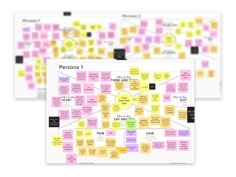
After writing a research plan and a discussion guide, I interviewed lots and lots of existing customers and people within the data sphere. I recorded all feedback in Dovetail. From that, I ran a workshop with the team at Zyte and we mapped out our personas (something we'd never done before). I included my own insights and our subject matter experts also fed-in some valuable insights. It appeared the value proposition was our biggest issue. So we decided to base the persona workshops around jobs-to-be-done around value prop.
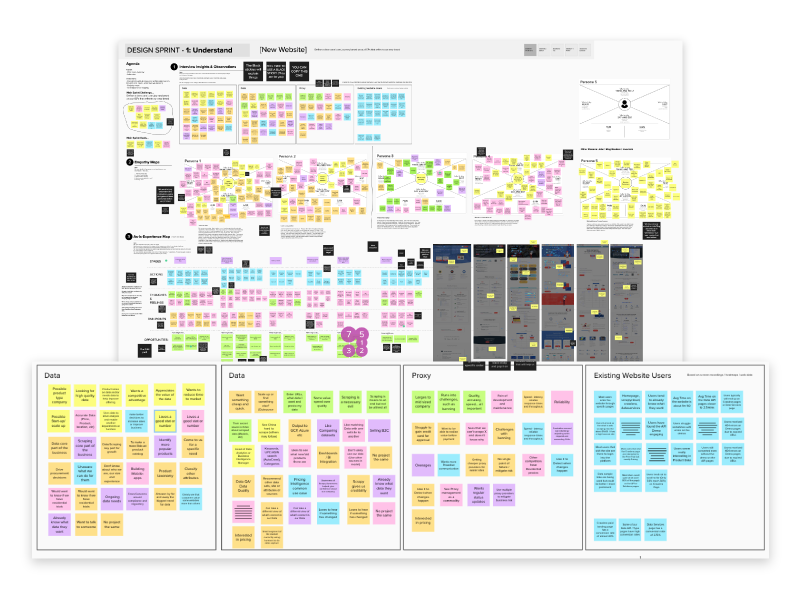
So with value prop in mind, some important assumptions we thought we really understood now were:
- Compliance, security and privacy weren't explicit enough on the site.
- Potential customers wanted to see more proof of data quality.
- Social proof made them feel good but they wanted to see bigger names.
- No breakdown of expenses. Wanted to make sure costs wouldn't get out of control.
- Speed was everything when it came to specific personas looking for Proxy solutions.
- Too much marketing fluff, not saying what we actually do.
- Residential proxies were very much desired but they are expensive.
- I need simple ways to convince my boss, I don't see it.
- I need to understand better what kind of data I can get and how I can use it.
We also did some usability testing of the old site so we wouldn't carry over any bad habits. Common insights were:
- I don't know what web scraping is and it's difficult to find out.
- Code on the site was very difficult to read.
- I don't know if I'm logging in or signing up after the call to action.
- I really like the demo on the site, I'd like to see my use-case.
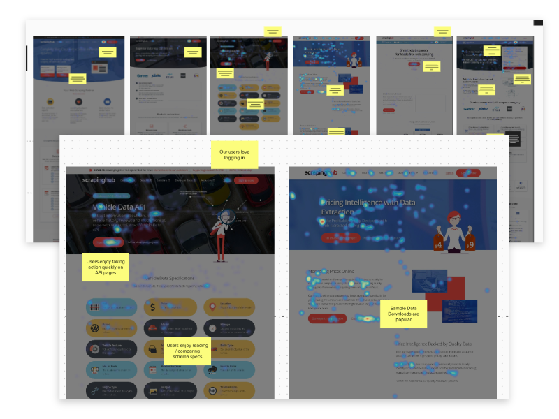
I combined what we learned with some quantitive data I collected from Hotjar. I looked at the whole funnel. With all the insights now recorded, I got the team together and ran an ideation workshop and we came up with quite a few "How might we's." They were:
- How might we make the experience more personalised?
- How might we improve our data sample library?
- How might we make ourselves and our site more accessible?
- How might we make ourselves the best place in the world to learn about web scraping?
- How might get more literal? Cut the fluff!
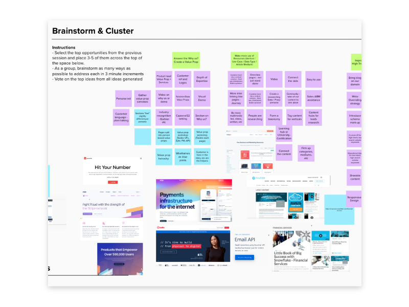
We were a fully remote company and after a few workshops, I thought the next round could be a little bit more asynchronous. Using Mural again to collaborate, I got the team to start to come up with ideas for the "How might we's." After a couple of days, they all brought sketches, screenshots, etc to the table, some of which were great at solving some of the problems. The value prob issues were probably addressed the most.
I added in a few myself and then I got to work with some design. With some hypothesis in-mind, first I mapped out the existing information architecture. Then I came up with an idea for a new one with some of the proposed solutions at hand.
I then sketched out a few ideas and presented them to the team. Some stakeholders at this stage were from senior management. I went back to the start of our work and took them on a journey to give them context. I presented the wireframes, explaining my reasoning and how it could meet our goal for improving conversion. I also teased them with a few screens of how it could look with the new brand.
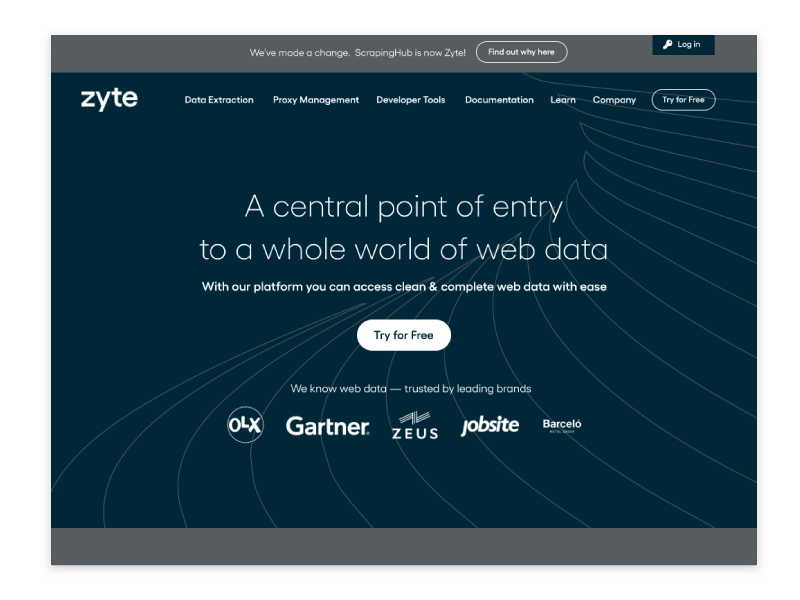
The team were very impressed with the work so far. They had a few concerns regarding delivery so I helped break the scope down so we could release this iteratively but trying to the keep the value to the user to a maximum. Engineering managers came up with some great ideas to improve the demo from a technical perspective.
Once we agreed on the iterations, I broke it down to 3 epics that we would deliver in as many quarters. I then broke the first one into user stories. I got all of this into Jira so the team could move forward.
I took on my work and built my side of the website in Wordpress. The dev team took the back-end stories for some of the more technical stories.
We released the website and brand "Zyte" in December 2020. The conversion rate of some of our new product pages increased by 10%.
I have since left the company and the site has altered. I think this is due to having more focus on services and proxy management. That initial release took me 4 weeks to build and is something I am very proud of.