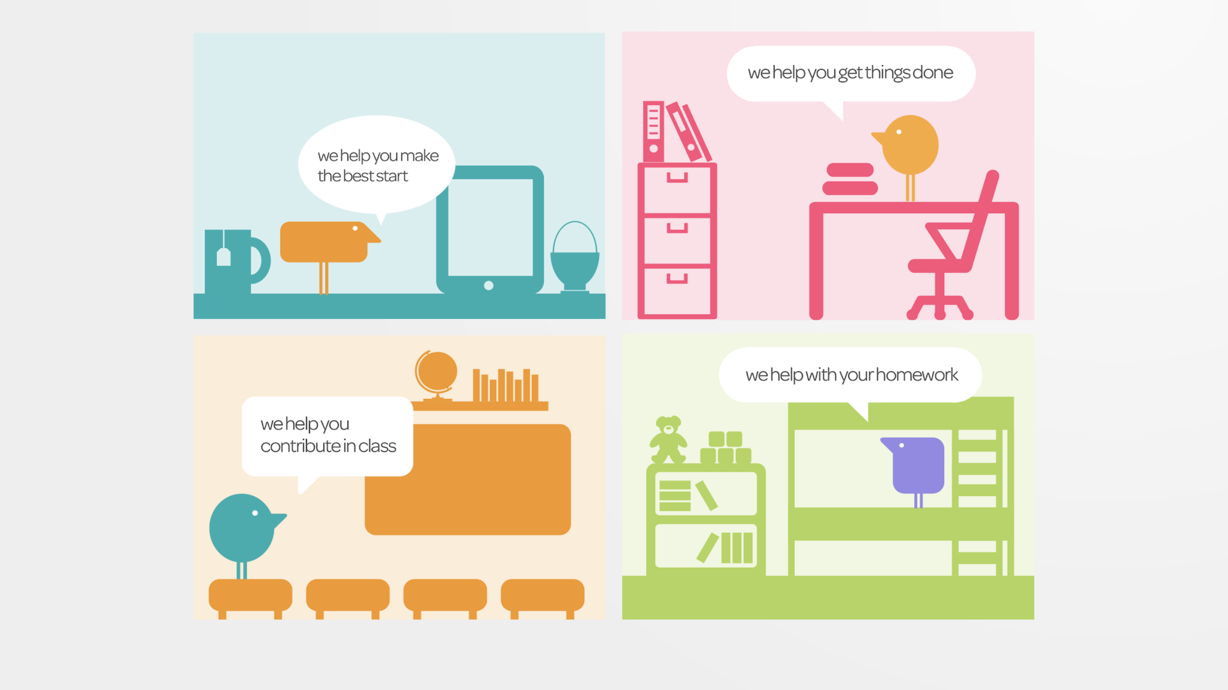
Out with the old. In with the New!
Creating a brand that would be loved by millions of students and employees alike
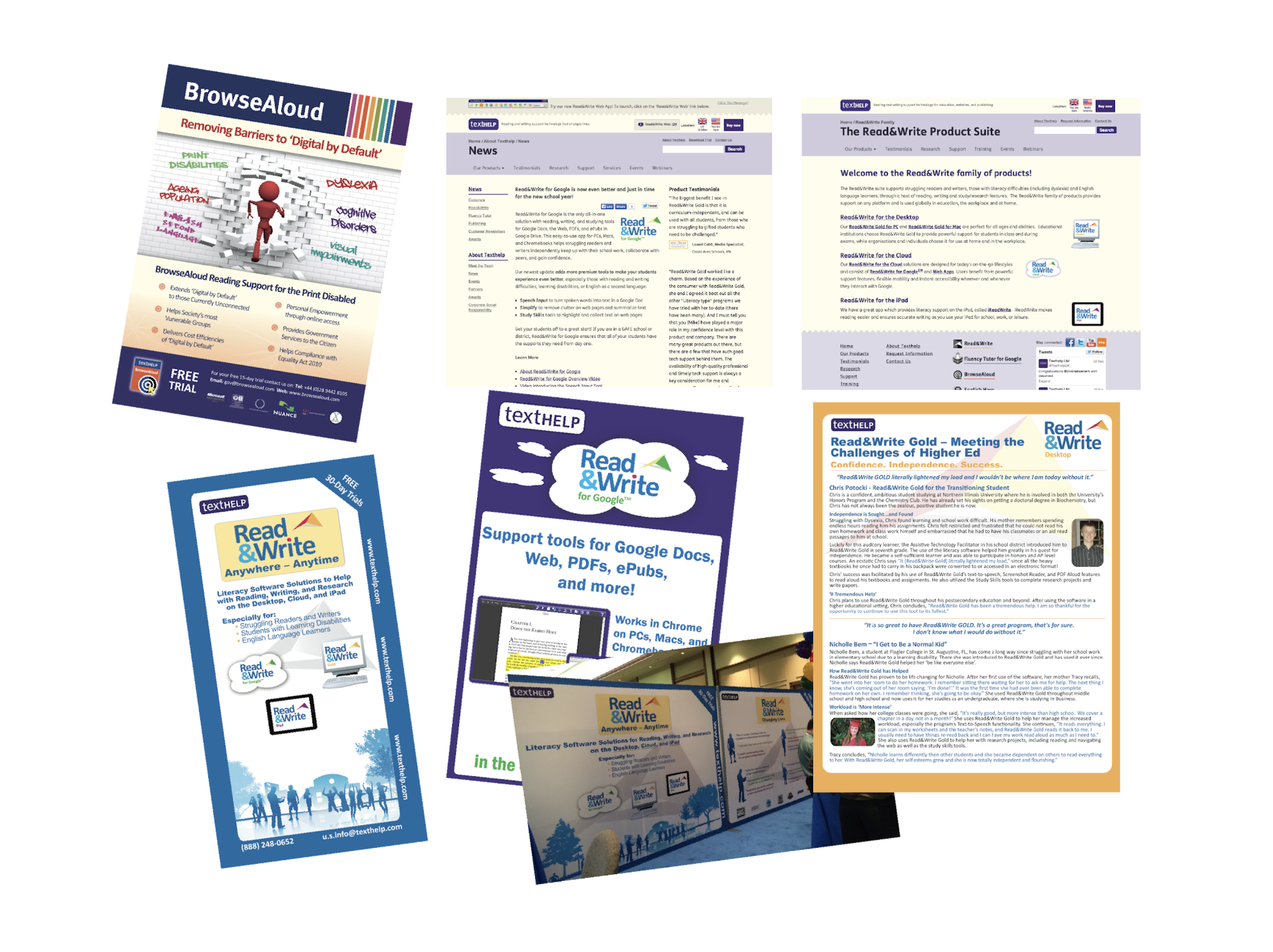
Pre-2014, Texthelp did not present a clear, consistent identity to the outside world - or even to ourselves.
Visually, our brand (and product sub-brands) were expressed in print and online through a mish-mash of styles, colours, tone of voice and logos.
It was hard to get a sense of who we really were. You could even call it an identity crisis.
What are we offering to our customers? What values do we believe in? If Texthelp was a person at the time, you wouldn’t have been able to understand what we really stood for?
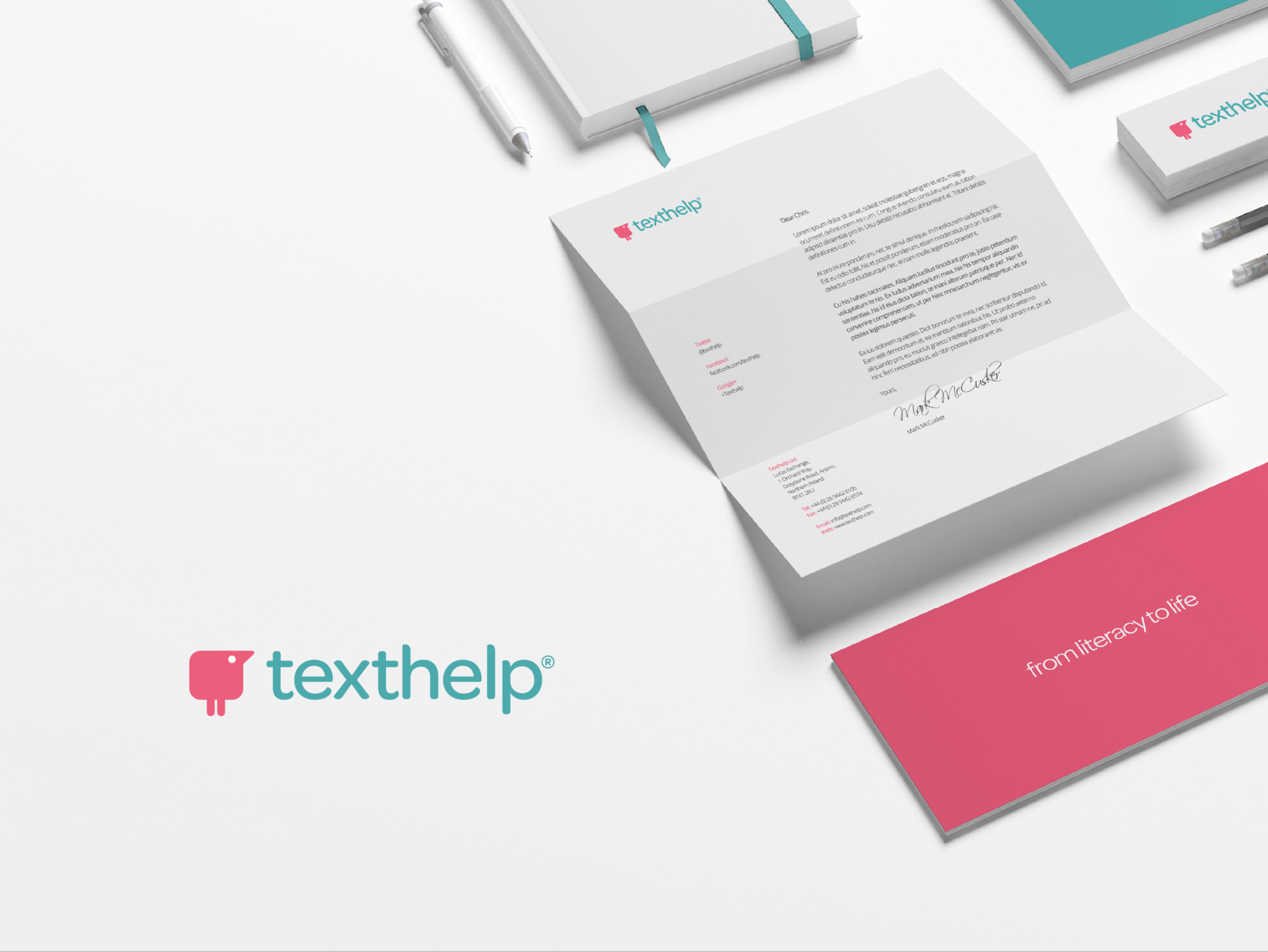
The need for consistency in all our visual and written communications was clear.
But we also needed to update our image, and the personality we express to our audiences.
Our previous tone of voice and graphic identity suggested that the company was very ‘corporate’, formal and distant from our end-users. The colours, visuals and language presented us as an organisation that’s was much colder and less forward-thinking than we really were.
So our old brand didn’t reflect the reality of who Texthelp was, or how we wanted to be seen.
My brief was to reposition Texthelp as an innovative, forward thinking company. An organisation that fosters understanding and communication for people who find literacy a challenge.
I wanted to create a brand for Texthelp and its sub-brands that’s warm, friendly and engaging... not cold, formal and technology focussed.
I wanted to engage with educational and corporate audiences by representing the needs of our target users and their values.
Our tone of voice needed to be:
- Human
- Warm
- Approachable
- Optimistic
- Inclusive
- Engaging
- Collaborative
- Empowering
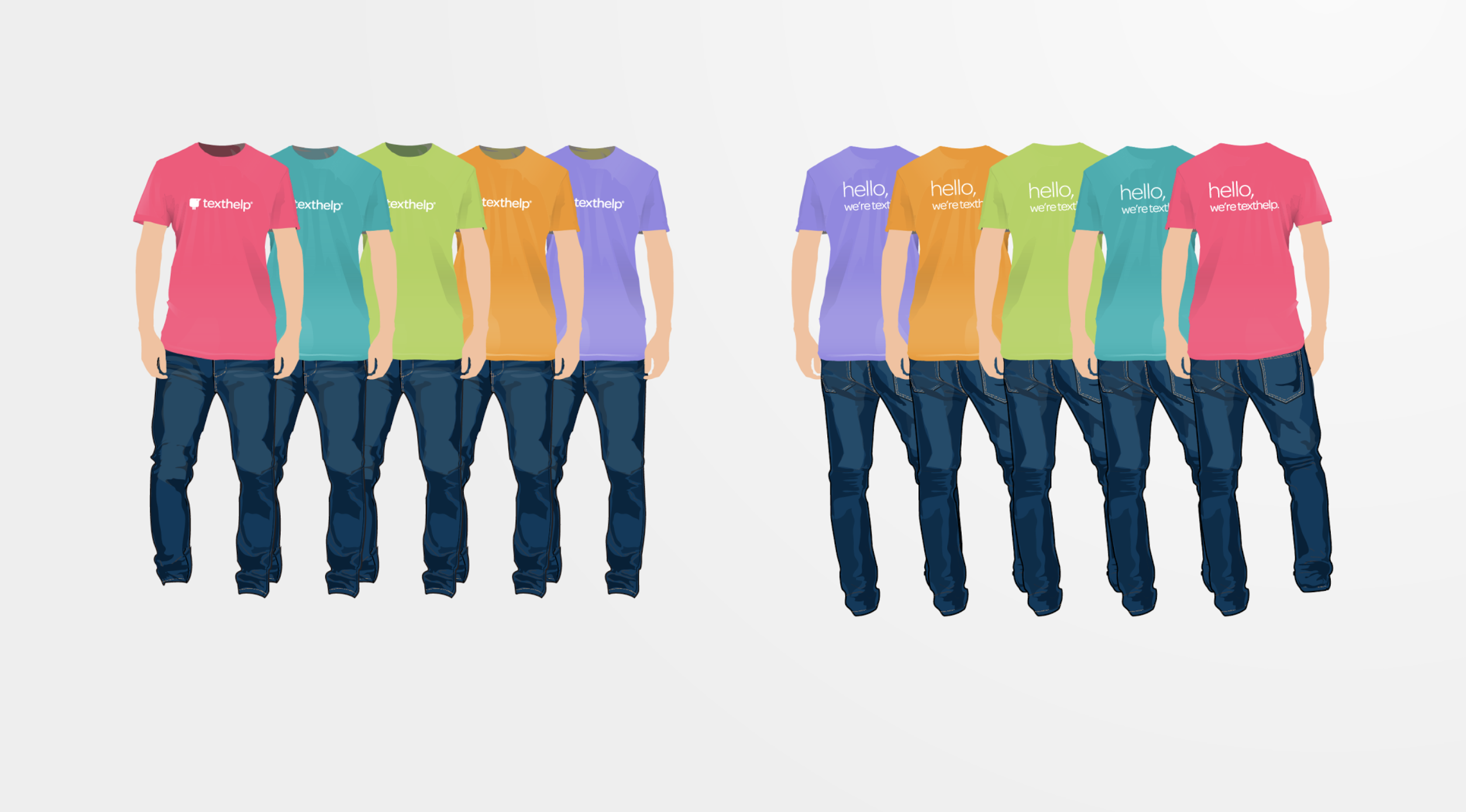
Brand Essence & Narrative
I started this process by writing a brand narrative. This is simply our story - the essence of what ‘Texthelp’ is.
This story is our fundamental reason for being in business. Our ‘why’ is all about helping people understand and be understood by others around them.
Functional attributes:
Texthelp are world experts in assistive and language learning technology. We offer a toolbox of reading and writing support software to educational and corporate customers.
Emotional attributes:
Texthelp wants to create an equal world of literacy and language opportunities to help create avid readers and fluent writers. A world where everyone is empowered to fulfil their true potential by being able to read, write, and be understood in whatever they choose to do.
What I delivered
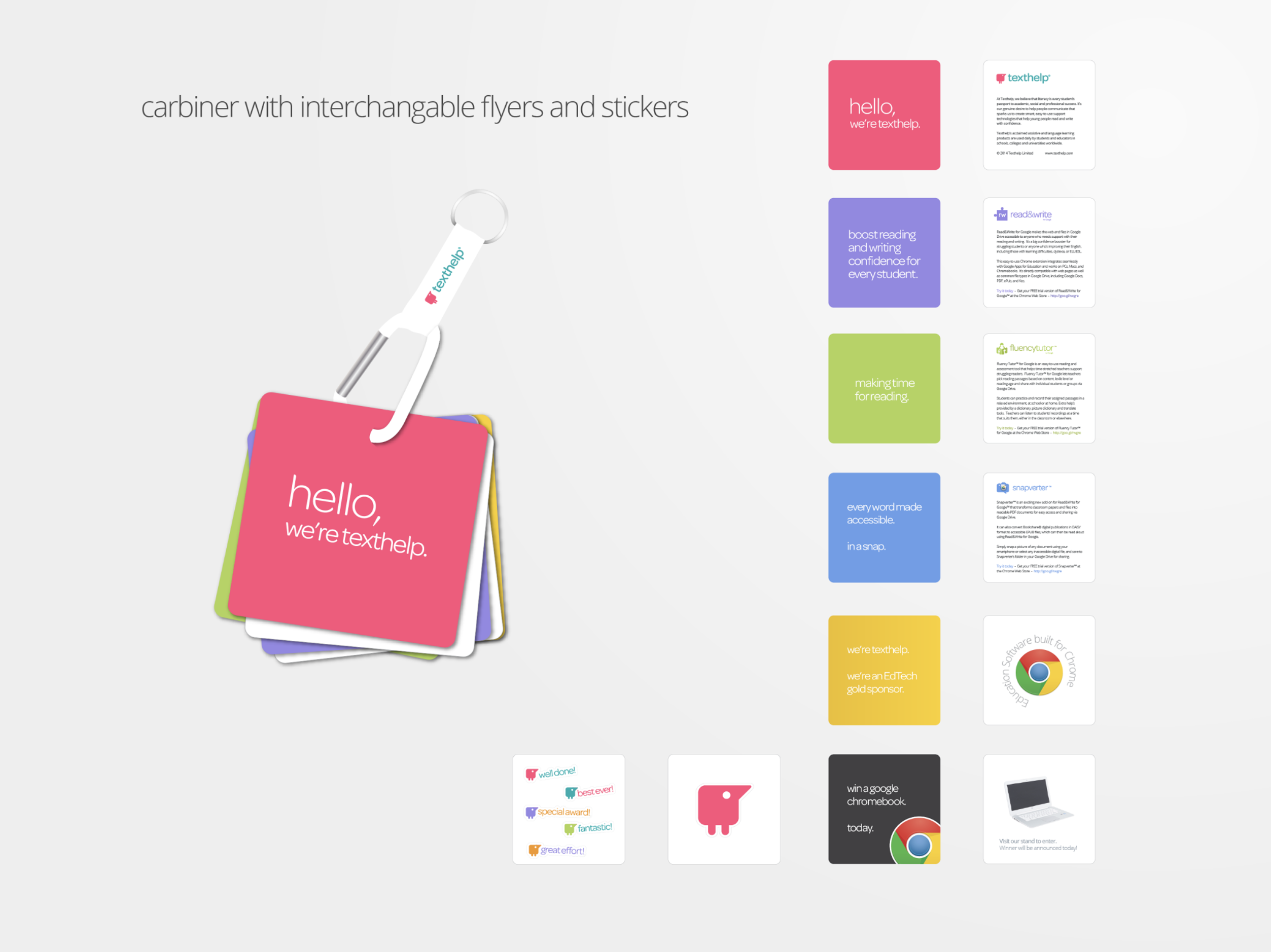
Based on our attributes, I embarked on a period of ideation. After a few rounds of iterations, I began to create assets after sign-off. There were a lot of assets that were created by me over a period of 6 years but most of the brand was created by me in the first 6 months. These were:
- Brand and product narratives
- Brand Guidelines including Logos, colours, tone of voice, illustrations and typography.
- Scripts
- Video production
- UX components
- Iconography
- Animations
- Social assets
- Sales enablement assets
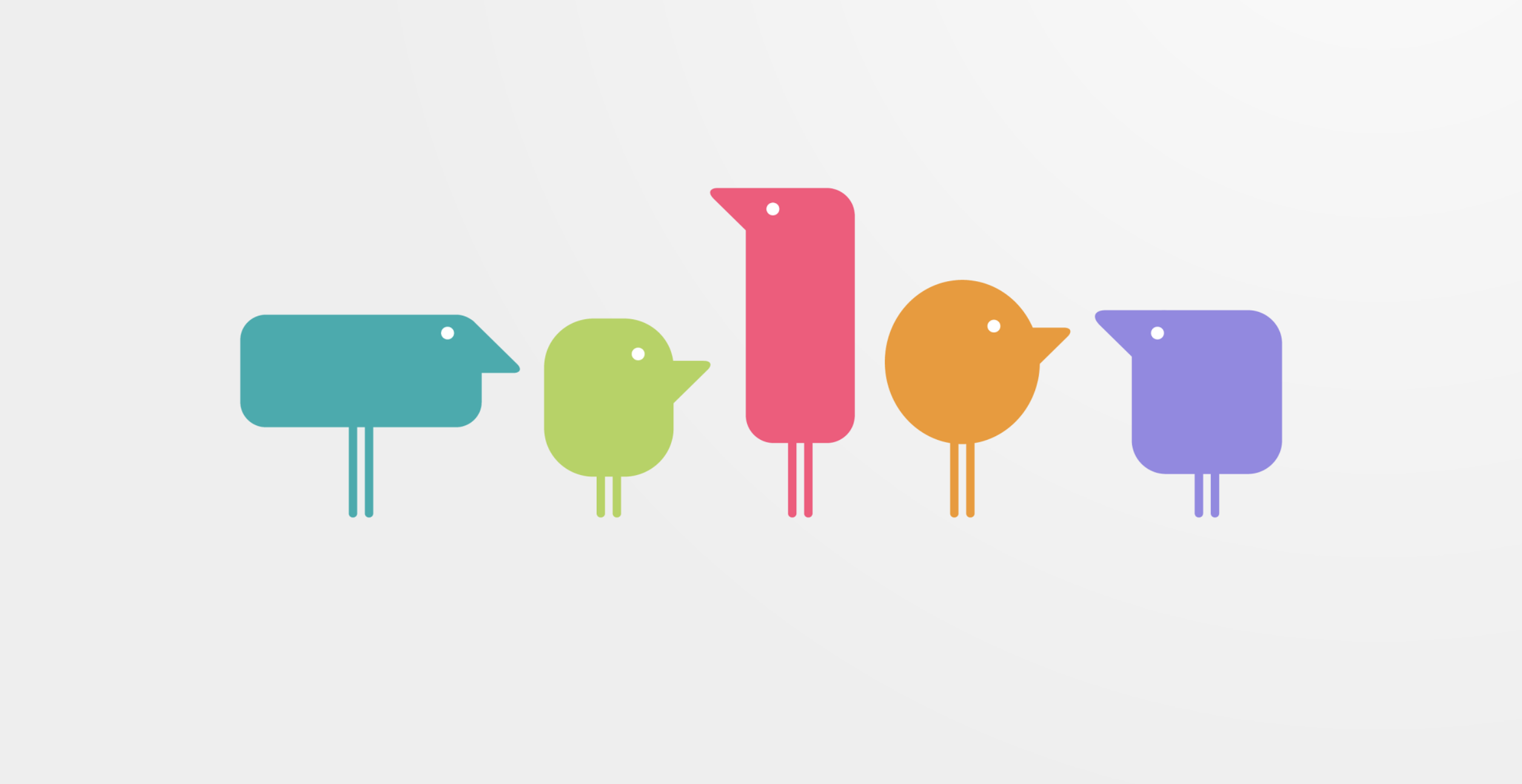
The brand is hugely popular. None more so than the "Jigsaw" piece of Read&Write and the "Texthelpers." Adults and kids think of them fondly and the products of the brand are now used by 100s of millions worldwide.
