Reduce risk through good UX
Getting in trouble breeds innovation
When I joined the Markets Tech - Risk & Control team, my boss Carla had one major job for me in mind. To reduce risk by changing the way we store data and creating a user experience around that data. Our vision was that everyone could monitor and reduce not only their own risk but also their team/organisation risk.
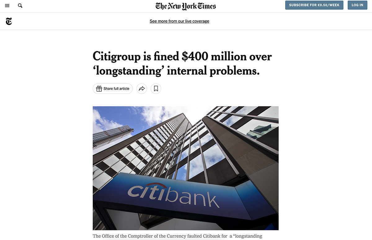
We had a CAP (Corrective action procedure). CAPs tend to shape internal strategy and trump other forms of work. Before I joined, Citi had been fined a hefty amount for not keeping tabs properly on their risk and so our processes, data and user engagement needed looked into.
This was NOT a small task.
I started out on a journey of discovery. I was completely new to not only banking, but also the big corporate world too. Small enterprises and start-ups were my game, so it was daunting for me at first. After I discovered what it meant to work for Citi, I settled into a routine and got working on discovery for this project.
First thing was first, what are the business requirements? I was supplied a ton of documentation. I had digested it down to the fact that we needed to reduce risk by centralising existing data and creating new systems to collect data going forward. Not only that, but we needed an intuitive user experience that would expose taxonomy of risk to end users that would allow them to take action on items that would reduce risk (Eg. Complete training).
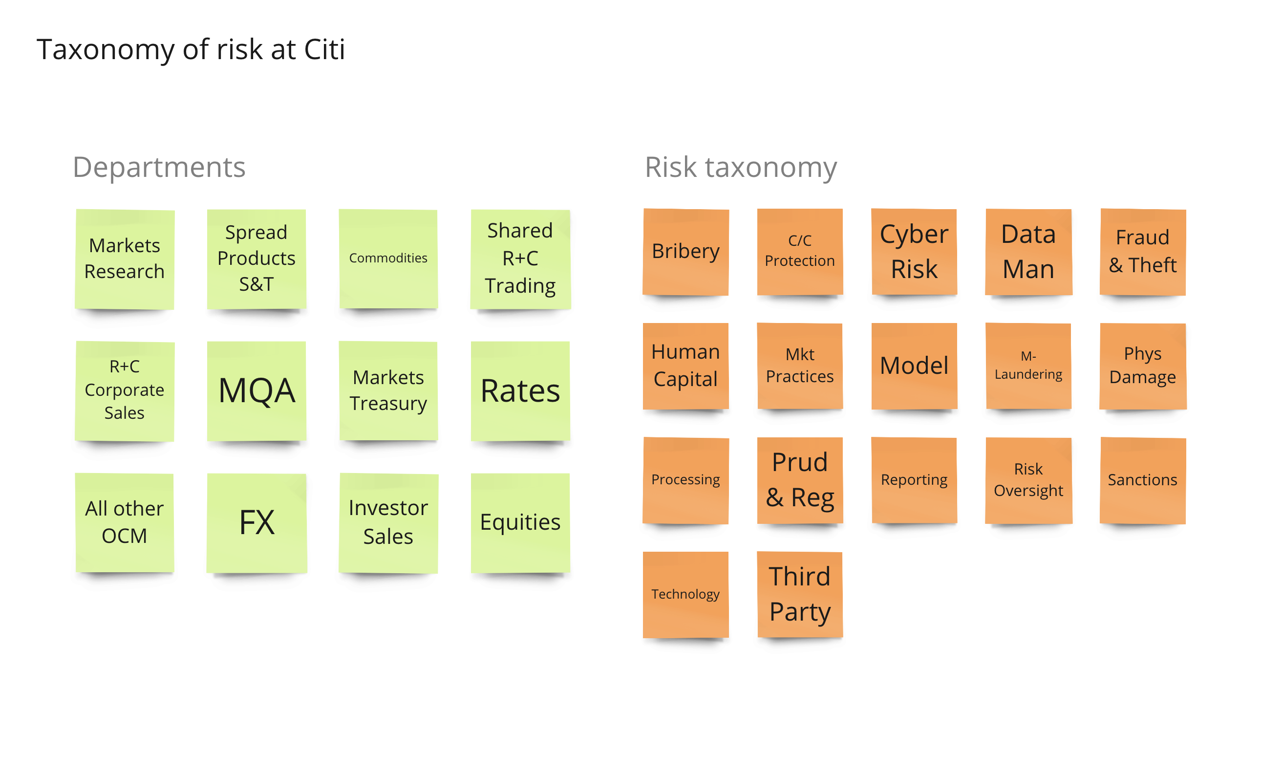
After understanding what was needed from a business point of view, I conducted a design sprint to get a glimpse of what life is like at Citi right now and what it could be once we have the data in place.
I conducted interviews with our target user audience. I wrote a discussion guide that would help me understand what risk means to each persona, how do they handle risk currently and what was their work/environment like. We decided not to boil the ocean and only focus on desk-heads and traders first. Insights I gained from these interviews were:
- Traders are busy. Risk is the least of their worries (but it should be).
- The floor is noisy.
- Some traders actually don't spend any time in the office (on mobile devices).
- When on a trading floor, the trader persona sits in front of two vertical screens and a 42" horizontal screen.
- Traders are monitored very closely by their managers.
- One trader could not be interviewed without his manager present.
- They have lots of overdue training.
- Their email boxes are flooded.
- They don't respond well to emails.
- They barely read emails. 10 out of 100 per day roughly.
- Risk items are mainly served through email and action is taken in individual systems
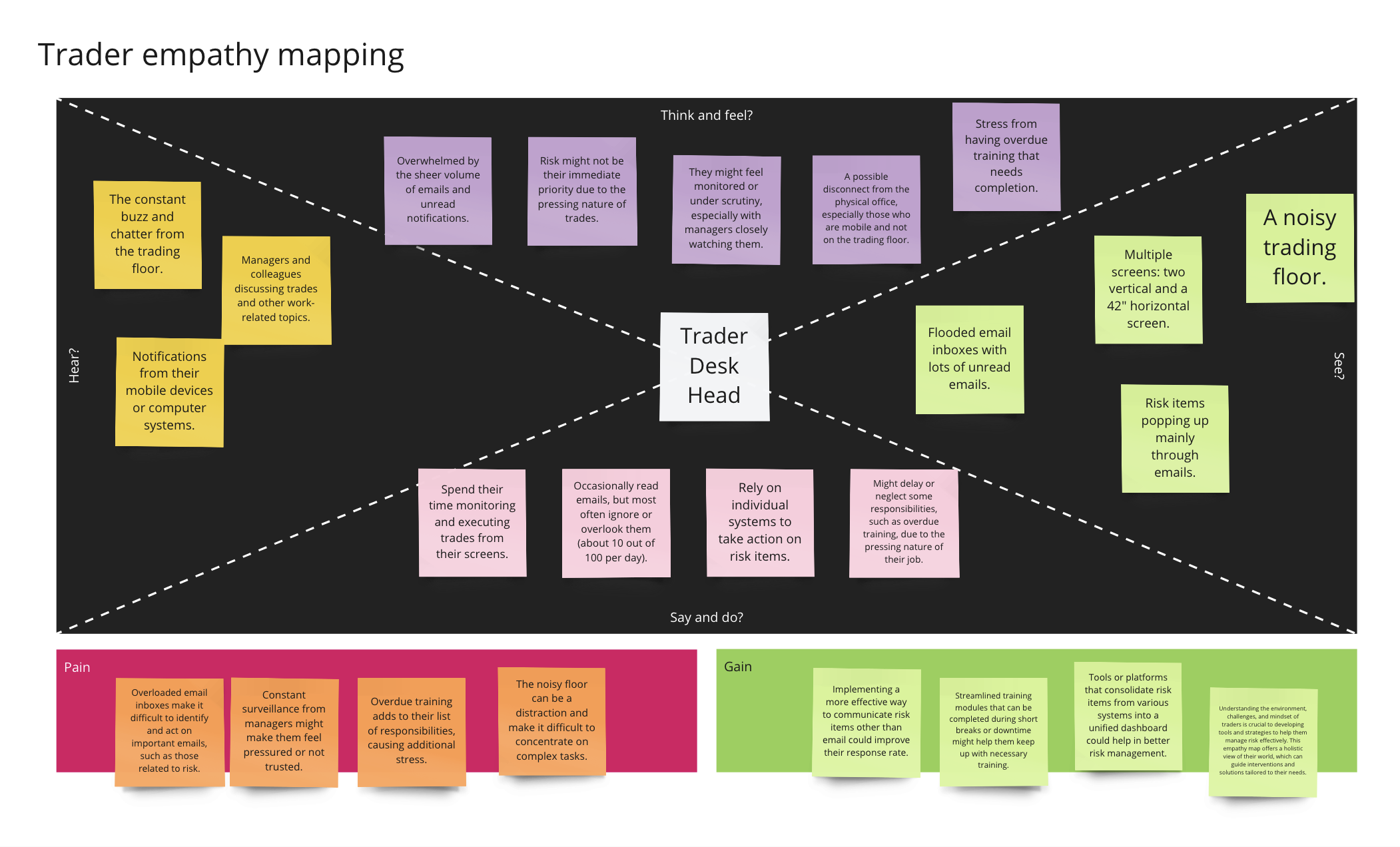
After the interviews, I got the stakeholders together and began to create empathy maps along with as-is experience maps. The pains were very apparent and from those I got the team to start to generate some How Might We's.
- How might we expose users to risk that was both fresh and required action?
- How might we help users keep tabs on their team's risk?
- How might we give senior management the power to keep control on risk company wide?
- How might we not allow excuses for unseen risk?
- How might we allow managers to expose issues with controls in order to make them better?
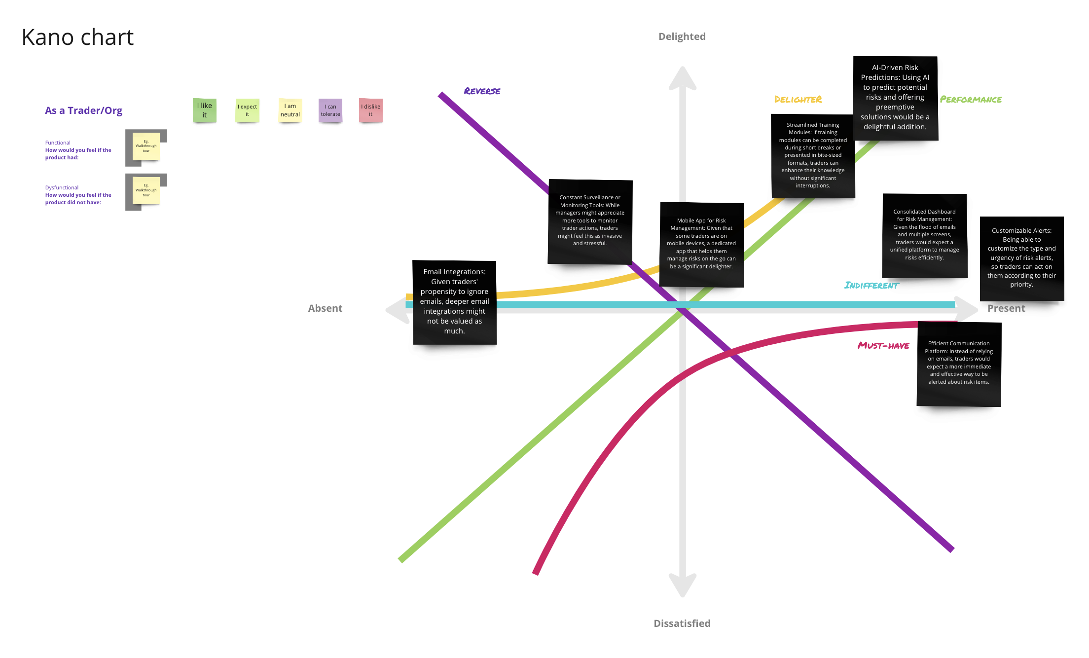
We began to ideate on these. We came up with lots of ideas. More than I expected. We went wild. I decided at this point to use a technique called the Kano Method. It would eventually help us prioritise some of the ideas/features that we'd come up with. One good thing about Citi was that we had a fantastic social forum allowing access to lots of teams company-wide. So I ran a survey to help populate my Kano chart. Here were the results:
- 95 users thought having a UI containing all actionable risk would be a must-have.
- 94 thought having a risk score would drive them to keeping their risk in good stead by qualifying it as a performance feature.
- 85 desk-heads welcomed the possibility of having a holistic heatmap on risk for their team. Another performance metric.
- 65 users thought that controls were broken most of the time and qualified a way of being able to report on them as a must-have.
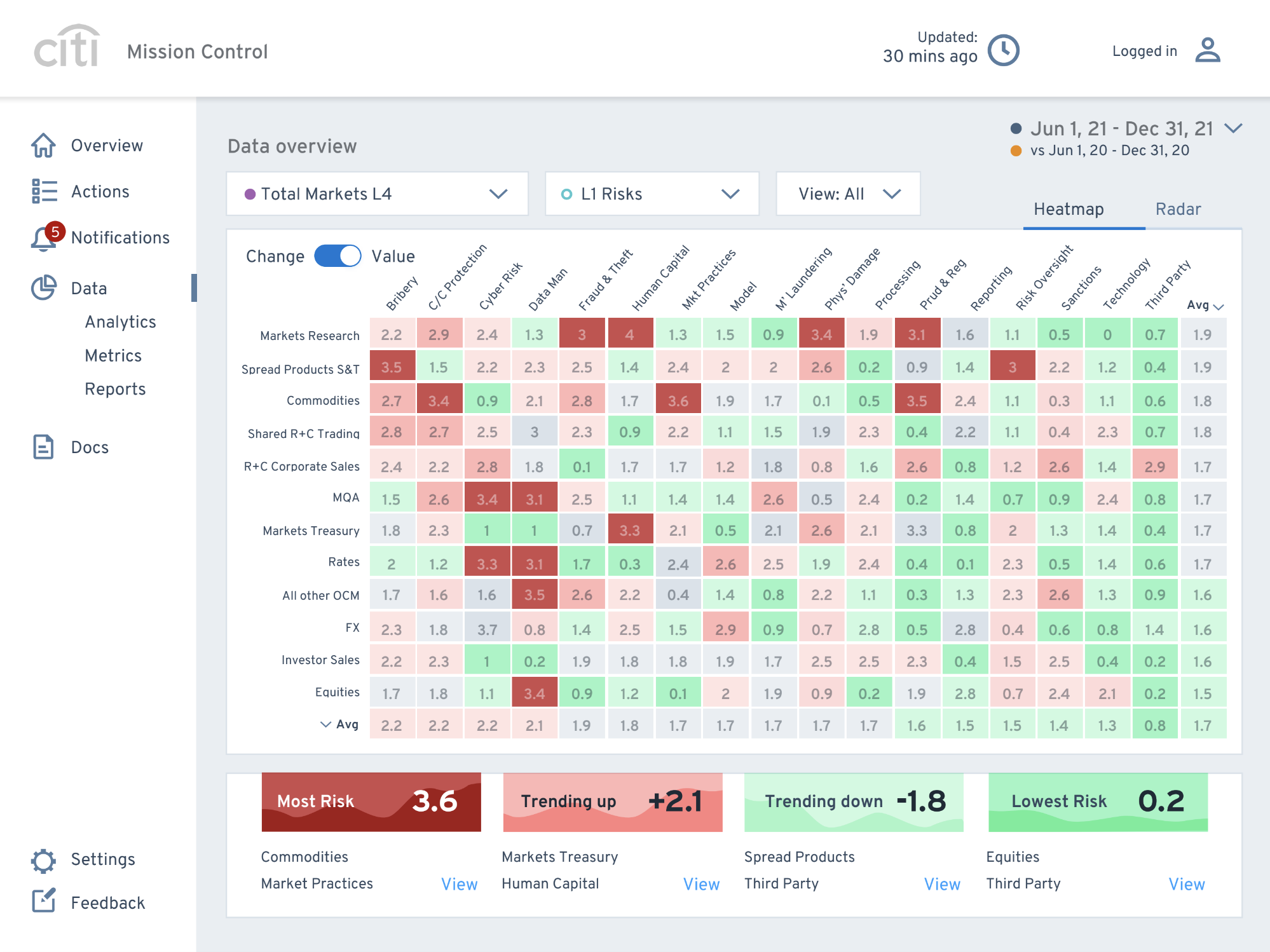
After a quick feasibility check with our 3rd party engineering team, I used this data to prioritise some wireframe exploration. I created initial screens to allow my manager and I to do a bit of a roadshow and sell the ideas to senior stakeholders. Take them through what we had done so far, our findings and show-off our solutions. We did use it as a bit of a critique, which I love, but the screens and ideas were very well received all round.
Check out the wireframes here.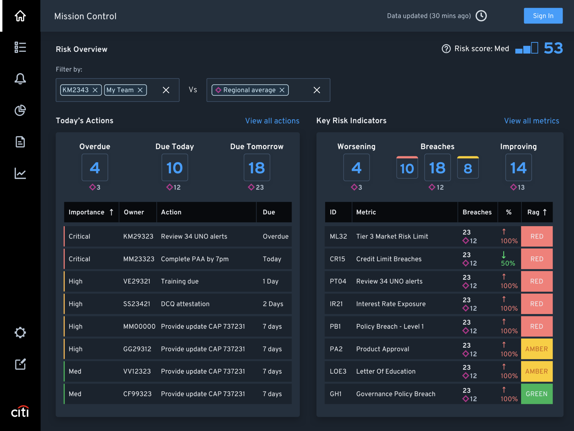
After a successful round of presentations and discussions (even getting a few rewards along the way), I started to break the project down. I created a series of very low-fidelity prototypes per user story matching pre-agreed acceptance criteria.
These prototypes were shown to engineering. They had helped with the feasibility earlier in the ideation process but now it was for putting a backlog together for the MVP, breaking into small chunks and recognising possible dependancies.
After that, I brought it in-line with our high-fidelity design system, introducing new components and submitting them to the global UX team for approval.
I left Citi just after they began to build but I believe it was a success.