Improving the First Impression: Customer Lifecycle at CGX
Getting to know our users through and through
As Head of Product at CGX, I led the transformation of the First Impression stage of the customer lifecycle, focusing on onboarding, scheduling workouts, progress tracking, and content discovery.
Key Contributions:
Streamlined Onboarding: Redesigned the user journey to reduce friction, ensuring new users understood the app’s value quickly and confidently.
Enhanced Scheduling: Introduced an intelligent scheduling assistant to recommend workout times based on user availability and goals.
Progress Tracking: Developed a gamified system with badges and streaks, boosting user motivation and retention.
Improved Content Discovery: Overhauled the Discover section with personalised recommendations and dynamic content highlighting popular workouts.
Research and Tools:
Conducted extensive user interviews to gather insights on pain points and expectations.
Utilised a Product Discovery board in Jira to map out user journeys, track hypotheses, and prioritise features based on business and user impact.
Conducted a Kano survey to evaluate feature desirability, enabling data-driven prioritisation of key improvements.
People and Project Management:
Facilitated cross-functional workshops with design, engineering, and customer success teams to align on project goals and deliverables.
Established clear roles and responsibilities within the team, fostering accountability and collaboration.
Held regular stand-ups and retrospectives to maintain momentum, address roadblocks, and ensure continuous improvement.
Provided coaching and mentorship to junior team members, enhancing their skills and engagement.
Outcomes:
25% reduction in onboarding abandonment.
30% increase in scheduled workouts during the first week.
15% growth in user engagement, driven by effective content discovery and tracking.
Higher retention rates due to a seamless and engaging first impression.
This project demonstrated the power of user-centric design and rigorous research in driving engagement and loyalty, while fostering collaboration across teams to achieve measurable success.
So with those in mind, How might we make this app simple for everyone? How might we make it easy to get stuck in immediately? How might we keep them coming back for more?
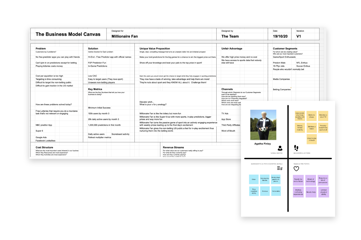
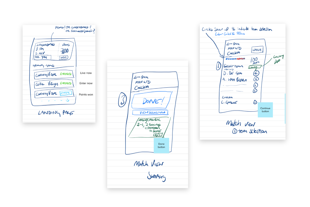
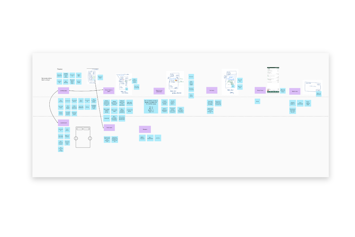
So after going back to some of our focus groups, I created user stories and user flows. I then tested some low-fi sketches with them. After that, I created a Hi-Fidelity prototype from those sketches that I made, with fresh ideas based around the aspect of simplicity.
I then tested this with the focus group and possible investors. They loved it but I challenged myself to make it even more simple (Think ONE button Kev, ONE button!)
We then teamed up with the Scottish Football Association. I designed a branded version of the app and created digital assets that would be included in the game.
Over two weekends we ran a BETA that included 4 matches. We proved some of our hypothesis. We also learned a lot that helped us create a backlog for future iterations.
We learned that:
- 84% of users entered a game immediately after sign up
- 68% of sign ups were active users and 17% were highly active
- 51 mins was the average engagement time (Over half of the game time!)
- 75% of users said they had a positive impression
- 81% of users thought the game was innovative
- 80% said they’d play this over another predictor game next season
- 95% said that they were more motivated by beating their peers than winning prize money.
Some of these surprised us a lot. We thought money would have been the biggest motivation for playing. We feel that makes our user experience even more compelling knowing that competition trumped monetary value.
We built this app to be white label. So, currently, the senior stakeholders are talking to potential customers/investors such as IMG, Paddy Power, La Liga and Premier League.
I have designed other flavours of this app. So in the pipeline are fan engagement apps for Golf, Basketball and American Football.
I'll keep you posted.